Empower customers by providing a seamless shopping experience for complex purchases on BBQ Wholesale
Overview
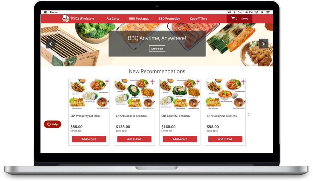
BBQWS is Singapore’s first choice in BBQ convenience. They are also Singapore’s largest BBQ caterer with the widest range of Halal BBQ food, packages, and accessories at wholesale prices and island-wide delivery!
ROLE
UI and UX Designer for a team of 4
SCOPE
8-month Initiation, Planning, and Execution for Project Phase 1
Research
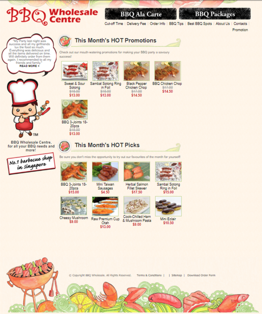
Their old site was not mobile friendly. Analytics has shown high drop off rate for mobile users.
Mobile users forms 60% of their total incoming traffic.
The Problem
How might we create a seamless purchase experience that handles the entire sales process with which customers can order customized packages easily?
Interview
We asked non-customers and regular customers to review the old website and discuss transaction methods. Currently, transactions can be made by visiting the shop to reserve and purchase or by contacting the business via WhatsApp.
They felt like brochure websites do not convert consumers and end up boring visitors because of their lack of customer engagement and static nature.
Disappointed with lack of online transactions, especially since most competitors offer it. Moreover, 89% of interviewees prefer the convenience of online transactions, payments, and delivery tracking.
User Audience

Device: iPhone XS or Samsung Note 10
Apps: Gmail, Instagram, Facebook, Redmart, & Whatsapp
Goals: Keep everyone happy (the client, manager, and the employees)
Pain points: Not enough planning, lack of transparency, unexpected leaving of work, Not delivering on time, and Repetitive work
Dilemma: She is responsible for organizing events for her family and her company. With her busy schedule, she aims to plan and manage events efficiently. However, it’s difficult to manually contact service providers for purchase updates.
User flow
Our vision after we developed and refined the user flow diagram to illustrate the purchase experience, incorporating multiple iterations to account for new promotional offers.

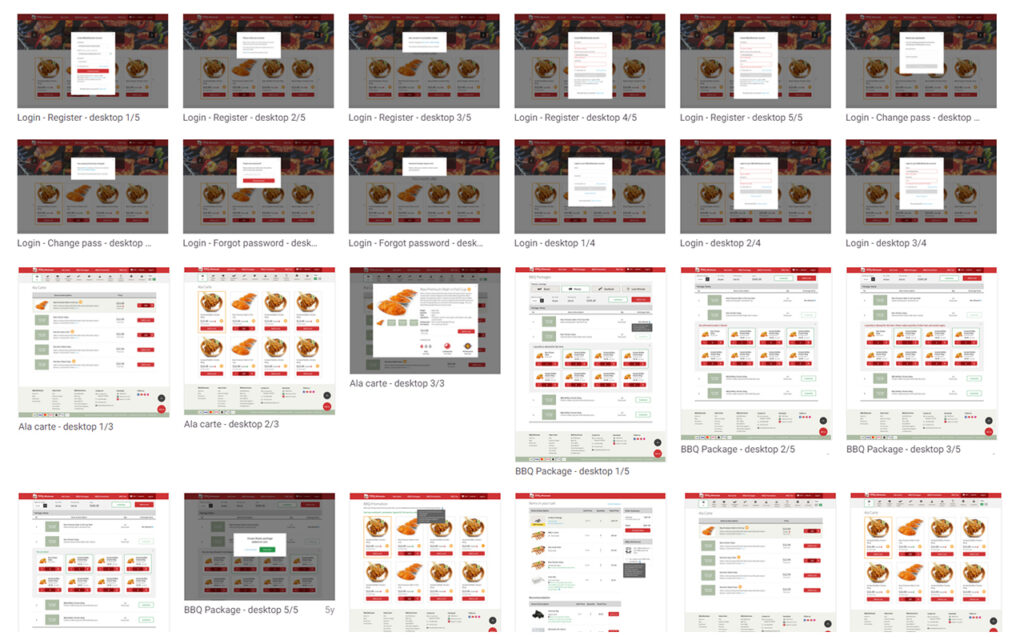
Wireframes
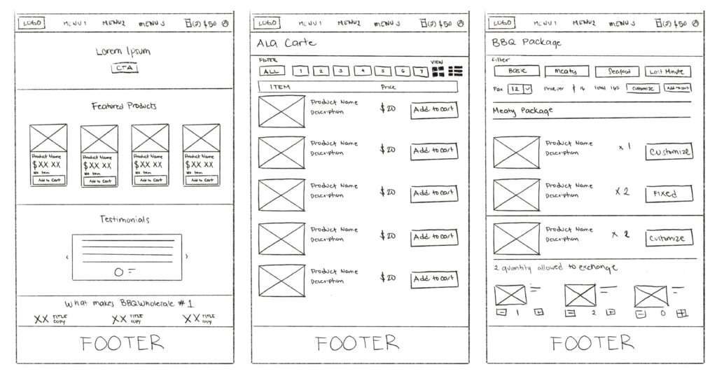
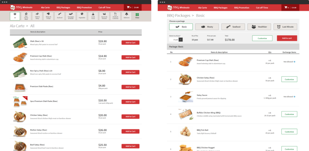
The first phase of this project focused on separating Ala Carte orders to Package orders. Ala Carte orders are commonly used for small gatherings at home or chalets. While package orders are commonly for company team building, reunions, and beach parties with bbq pits.
Low Fidelity

High Fidelity
Design Features
We developed a range of comprehensive features that significantly enhance the user experience, making it easier for customers to find recipes, purchase necessary items, and effortlessly customize their package orders.
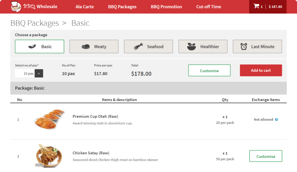
“Customizing my package should be easy, but it’s currently too complicated and time-consuming”
Problem: Navigating through various options and customizing their orders, especially when they have specific dietary requirements or are making last-minute decisions can be very challenging. This complexity can lead to frustration, order errors, and ultimately, a poor user experience.
Solution: Implementing a BBQ package page with intuitive customization options can significantly enhance the user experience by simplifying the ordering process.
We decided to offer a variety of pre-defined BBQ packages such as “Basic,” “Meaty,” “Sour Cream Seafood,” “Healthy,” and “Last Minute.” We also allow users to easily customize their these packages. This includes options to add, remove, or substitute items within the package. Provide real-time updates on the total cost and contents as changes are made.
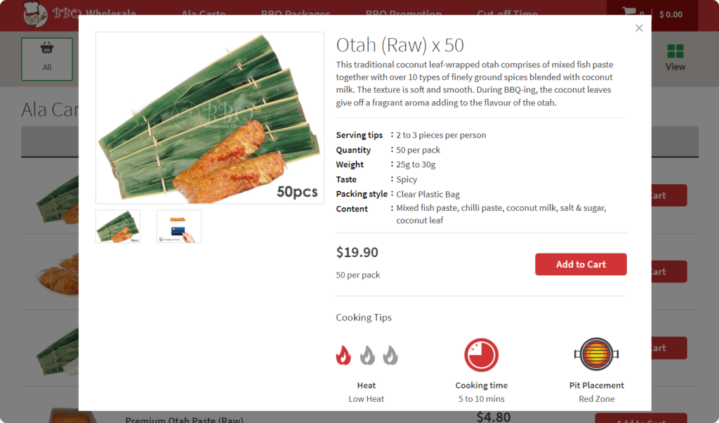
“As a beginner, I’d appreciate some basic tips on BBQ techniques and safety”
Problem: Many beginners struggle with understanding basic BBQ products, techniques, and safety practices, making it challenging for them to get started and feel confident in their grilling skills.
Solution: The pop-up feature provides a detailed product description and cooking tips that help enhance the overall user experience.
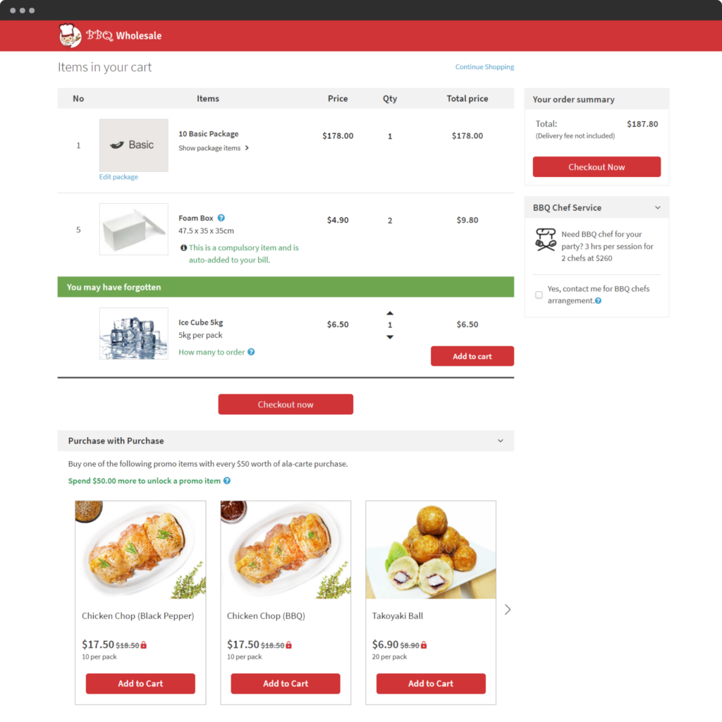
“I tried to customize my order, but it was so confusing that I had to call the company just to make adjustments. I wish I could easily make these changes online”
Problem: Customers often face challenges when navigating through the checkout process, especially when they want to customize their package orders. The complexity of adding, removing, or modifying items can lead to frustration and cart abandonment. Additionally, customers may miss out on valuable suggestions for complementary products, and promotional offers.
Solution: Implementing an intuitive cart page can significantly enhance the user experience by simplifying the customization process and providing valuable recommendations.
Design System
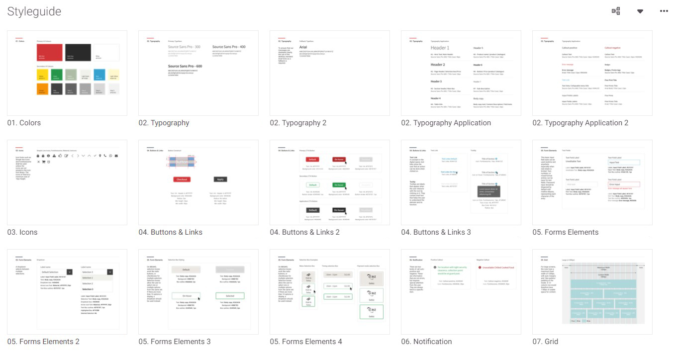
Zeplin was used for this styleguide so that we could easily share updates to the developers.
The Benefits
- Serves as a single source to view components, patterns, and styles.
- Allows scalable redesign and management of new changes within the same projects.
- Enables design resources to focus on complex problems/solutions rather than tweaking visual appearance.
- Ensures visual and functional consistency across projects.
- Facilitates quick replication of designs using pre-made components and elements.
- Reduces the need to reinvent the wheel and eliminates inconsistencies.
- Minimizes wasted design or development time due to miscommunications.
Outcome
We have evaluated their past analytics data, and performed an in-depth analysis of their business nature to uncover users’ preferences and traits to design a seamless online experience for online orders.
With the help of online promotions for the updated website and new order method. The drop-off has decreased from 64.2% to 38,1%. According to the client, the comparison of conversion to sales from a year-on-year comparison has increased by 29%.
Lessons
#1 Big challenges require small steps
We took small steps in making this project. We had to divide the project into two phases because the change was too big for the initial timeline that was given to us. Big changes can not be brought overnight, especially not just by a website alone.
#2 Be open to research and let ideas go
We had so many ideas that looked awesome during our planning phase and we thought too digitally and approached the product with too concrete ideas about the result, thus failing to correctly take into account some needs and challenges that are more important for the project to focus on.
#3 Journey Maps are my best friend
As it gets more complex, Journey mapping was very helpful to uncover problematic and promising points. We collaboratively analyzed all the possible scenarios and used excel to compile our solutions.
#4 Better interview questions
I would rebuild the interview questions differently to focus more on the experience that they need and their expectations so that we could create a more complete picture that is catered specifically to our customer’s needs.
#5 Better and uniform visual design
After reviewing the website and how the client is using it now, I realized that the visual language has yet to be defined. If I had more power over the project, I would have clearly defined the brand attributes in advance to help the visual appearance of the overall website.
View other case studies
Case Study
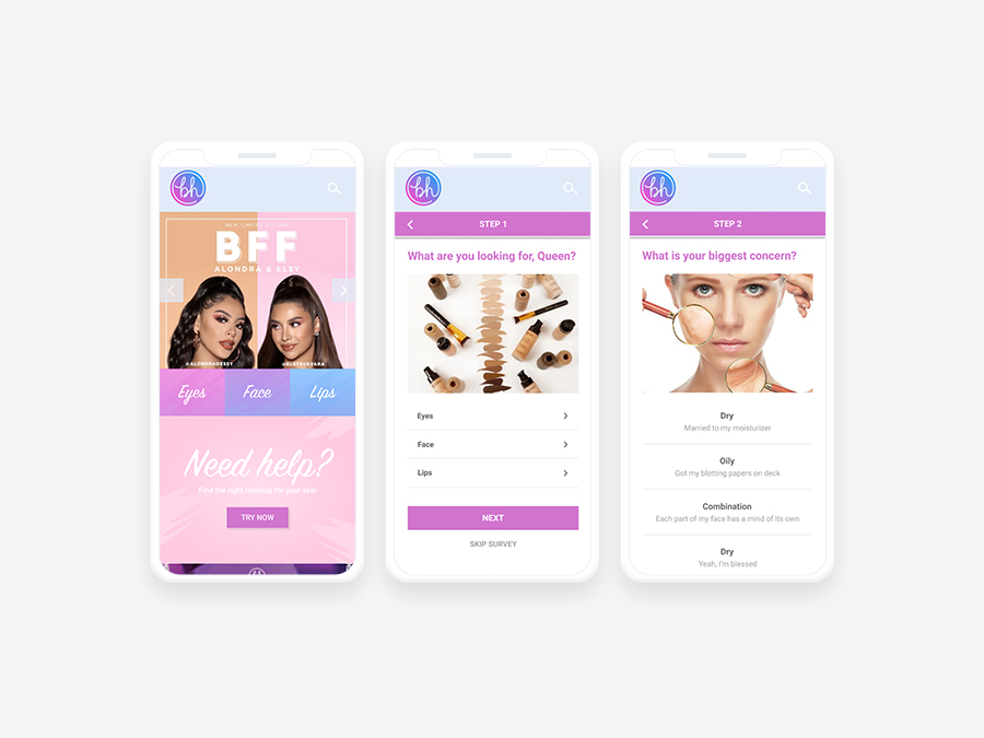
Assisting beginners find the perfect makeup that compliments their skin
Case Study
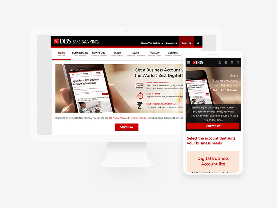
Providing a smooth registration flow for online bank opening to reduce high drop-off rates