Assisting beginners find the perfect makeup that compliments their skin
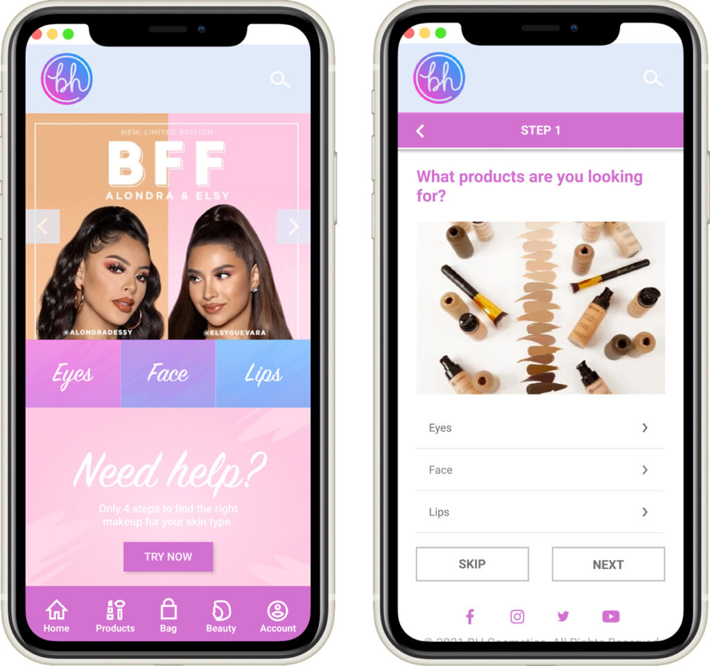
Overview
BH Cosmetics is a constantly evolving innovative beauty brand dedicated to bringing you high-quality, affordable makeup. It is an LA based company that are both present in physical and digital stores. Due to their affordable prices, most of their target market are teenagers and women on a budget.
YEAR
2021
Research
Factors such as closed stores, lack of access to beauty experts, and the nuisance of removing masks to try out make-up during the pandemic, are some of the reasons why makeup beginners are hesitant to make a purchase decision.
My partner and I worked on a website that will ease the barriers that BH Cosmetics face in accurately representing their products online to consumers, and the difficulties beginners experience when determining whether a product is suitable for them.
Interview
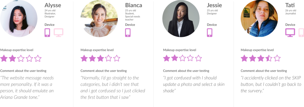
We asked non-customers and regular customers to review the old website and discuss transaction methods. Currently, transactions can be made by visiting the shop to reserve and purchase or by contacting the business via WhatsApp.
User Audience

Device: iPhone SE (2nd Generation) & Dell laptop
Apps: YouTube, Gmail, Snapchat, Instagram, Tiktok, and Facebook
Dilemma: Katie is struggling to find an internship because hiring managers think she looks too young. She wants to appear professional during her interviews, however, she doesn’t know how to apply makeup.
A strategy that she came up with is to follow makeup gurus, however, she is unsure if their product recommendation fits her skin.
Customer Journey
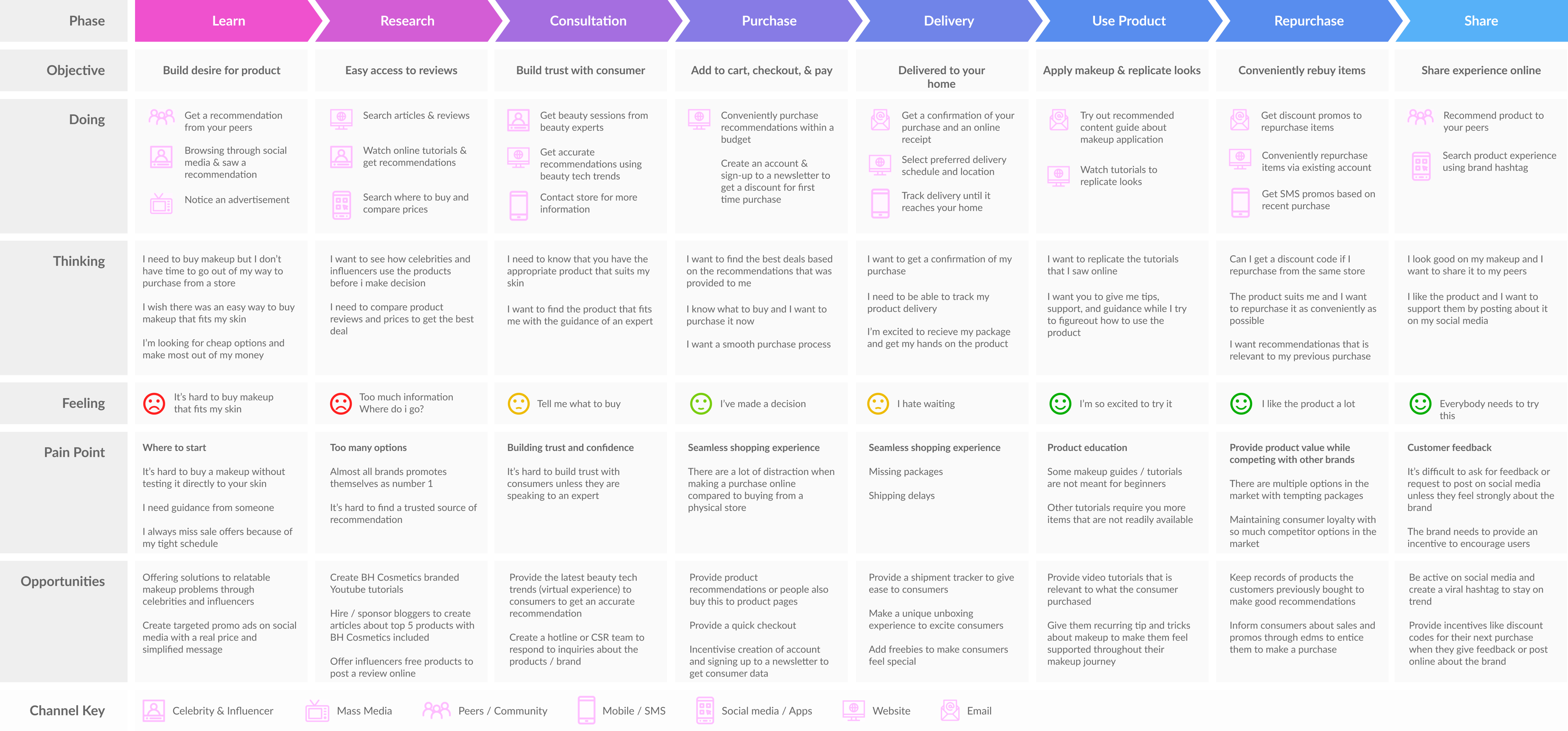
Here is an overview of the customer journey highlighting the pain points of the consumers while making a purchase decision.
User flow
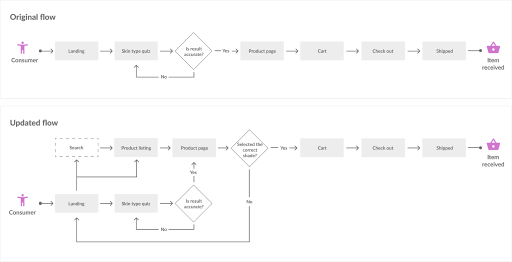
We realized that consumers have different ways of navigating through the website depending on the type of industry or business. The goal we gave was to buy cosmetics that fit their skin. Here is a visual representation of our assumed flow and our updated flow after the user testing.
Wireframes
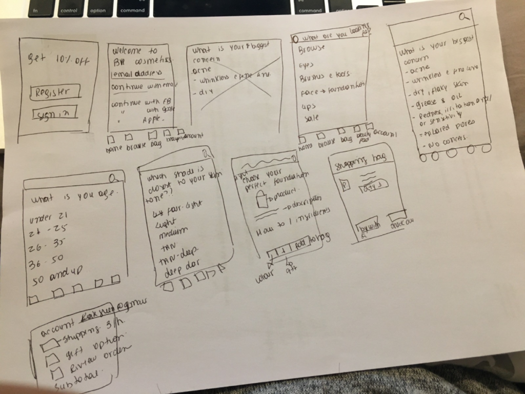
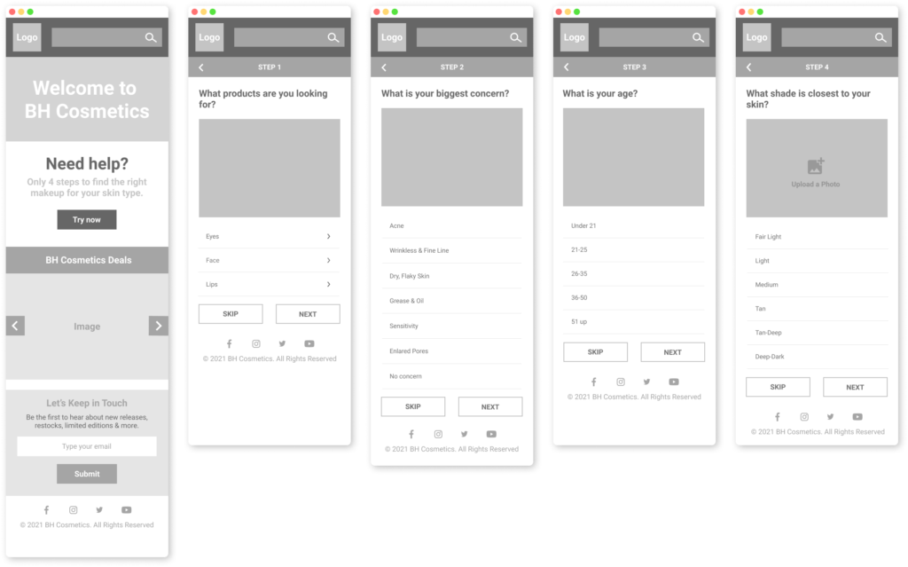
For this case study, we focused on mobile design based on project requirements.
Low Fidelity
Medium Fidelity
High Fidelity
Changes in Writing & Design
We had a lot of findings in our research but these are the highlights of our project changes after conducting our user testing.
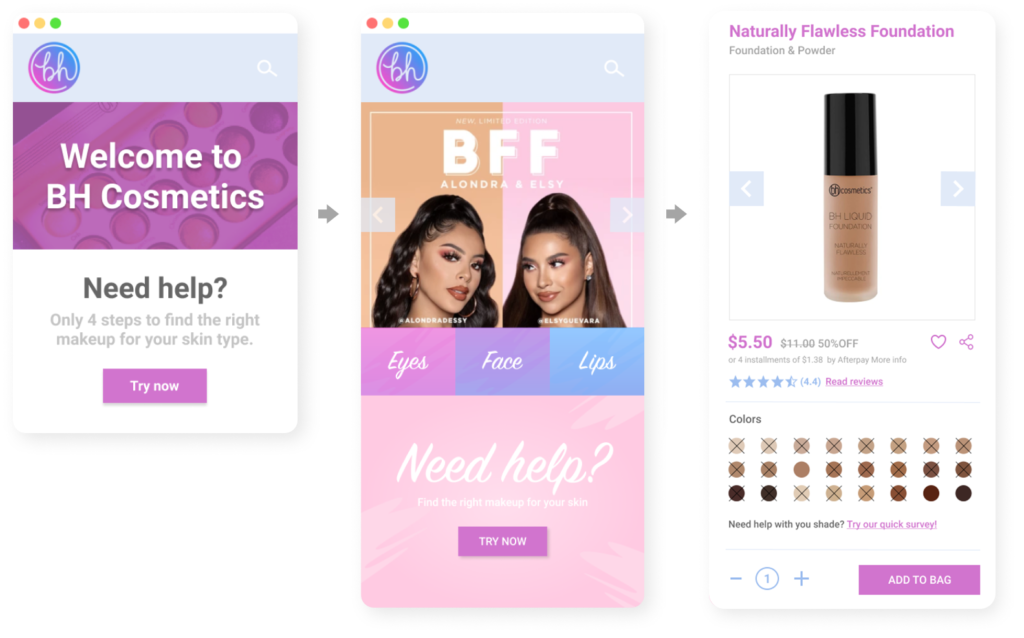
“Easily missable skin type quiz & makeup categories”
Problem: When given the instructions to figure out how to purchase a foundation that fits their skin, the participant used a different route and went straight to the product page, so they missed the Skin Test Quiz on the landing page.
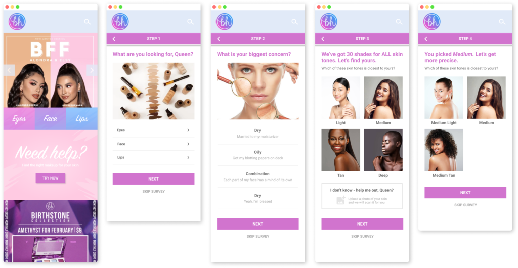
Solution: We decided to change our initial design (left screen) and make the updated screens easier to navigate and make sure that the quiz is also available in the select color section of the product page.
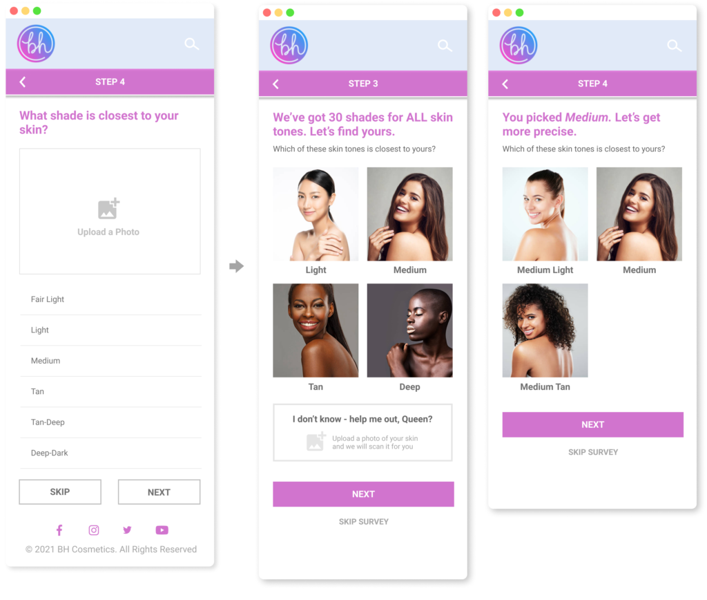
“The skin tone options are too narrow and vague”
Problem: The skin tone options are too vague and narrow. They wanted to see visuals to compare their skin tone and hoped to see terms commonly used in the makeup industry such as Warm, Cool, and Neutral.
Solution: We added image references per skin tone and skin undertone to help consumers find the best product option/s suitable to their skin.
Outcome
After the prototype adjustments, the users trust the Skin Type Quiz more as a tool to guide them in purchasing the correct shade of makeup for their skin
During our second test, our participants felt that the quiz results were more accurate due to the skin sample photos that we added for reference and the broader choices of skin tone that were provided for them by adding an additional step.
Lessons
#1 Importance of understanding user behavior in navigating through a website when purchasing makeup and adapting it to our prototype
While working on the prototype, we were able to understand the complexity of users’ browsing habits. We had ideal scenarios planned out, however, the users each had different ways of navigating through the website to complete the goal that our team has provided for them. Their actions vary depending on their usual shopping behavior which means we need to adjust our website flow to accommodate these habits and give our users a better browsing experience.
#2 Importance of UX Writing and setting a tone of voice
We also realized the importance of the tone of voice in making relatable content and inspiring our consumers. After making the necessary amendments to our content, we found a considerable increase in consumer engagement.
#3 Benefits of validating changes by setting up a second round of User Testing
We were able to validate the changes on our prototype by conducting another round of User testing and comparing the results of both tests. After analyzing the data gathered from these tests, we were able to pinpoint the flaws in our design and website flaw and apply the necessary changes. The result of all these adjustments was a remarkable improvement in our prototype.
View other case studies
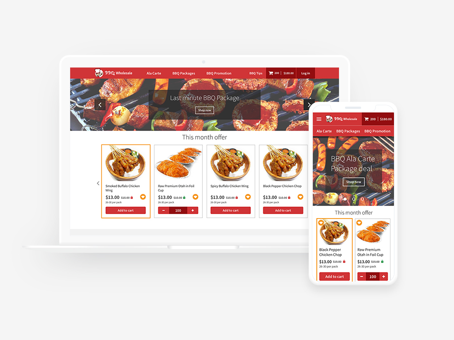
Case Study
Empower customers by providing a seamless shopping experience for complex purchases
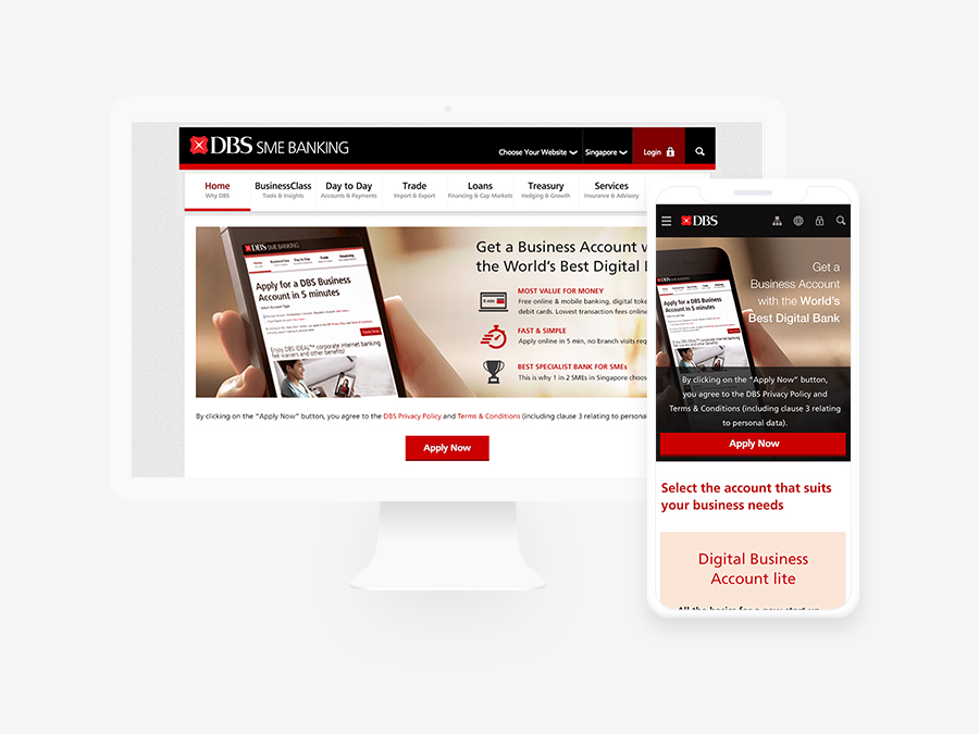
Case Study
Providing a smooth registration flow for online bank opening to reduce high drop-off rates